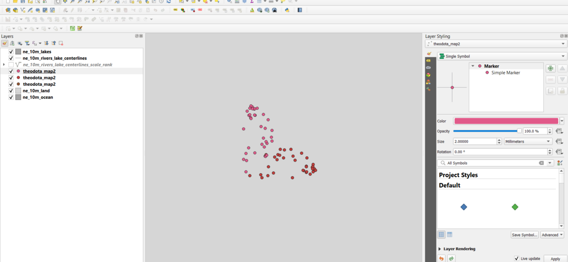
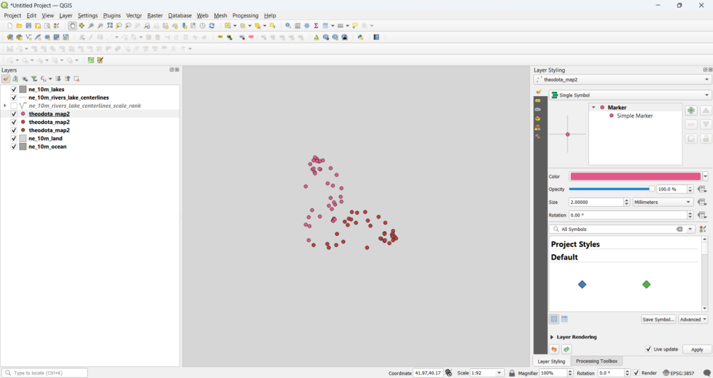
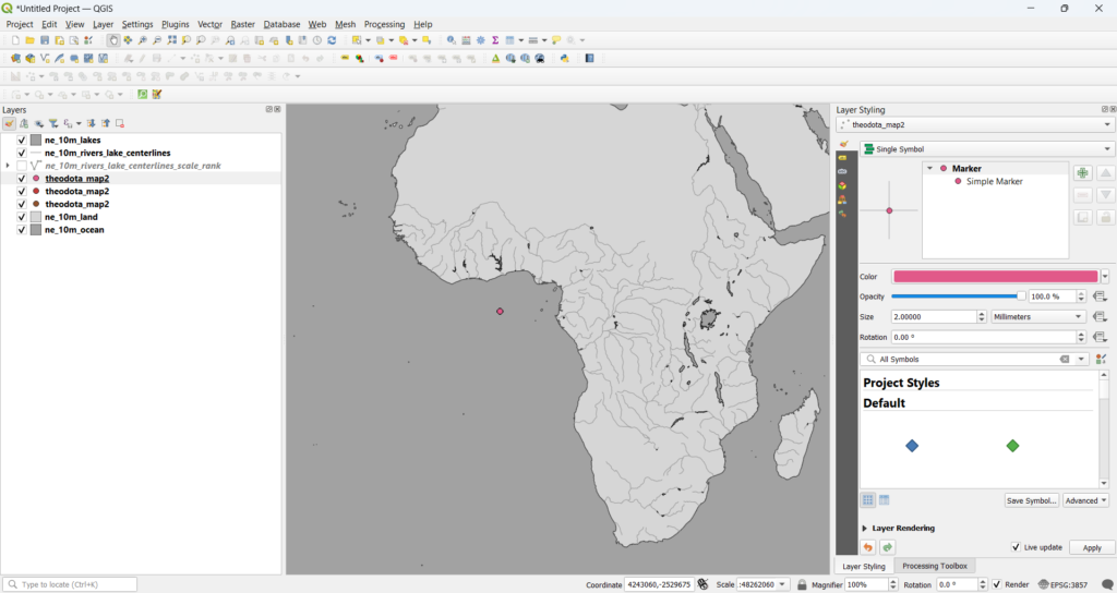
There is a mythical land known among digital cartographers and practitioners of the digital humanities alike. The name of the island is only spoken in hushed whispers: NULL Island. This island, which has only appeared on maps since the digital age, is rumored to lie roughly 500 kilometers off the coast of Africa. Even the most skilled map maker has on occasion found themselves marooned on this unforgiving island. Rarely do digital cartographers seek out this island. Instead, the island finds them due to some error in the code. “Did I forget to change the map projection?” mutters the dehydrated captive for the third straight month in a row. “Was the error in the source data?” NULL Island, so dramatically reconstructed here, is a result of any number of different errors in digital mapping software which incorrectly projects data into the waters off Africa (or into Africa itself on occasion). The fabled NULL Island is appropriately located at 0,0 on Mercader projections. So, when digital topographical data shows up here, the mapmaker (unless they are making a map about the western coasts of Africa) knows they have made a serious error.
A casual reader of this blog may rightly ask what this quirk of digital cartography has to do with Koç University’s Research Center of Anatolian Civilizations (ANAMED). It is in just such a place as ANAMED that one finds the right companions to brave the dangers of NULL island. For one of the great perks of being an ANAMED fellow has been the academic community and the trips taken with members of that community. For instance, the Byzantine Studies working group planned various working trips throughout the city of Istanbul and a longer trip to the Tur Abdin. Among these groups, I, along with Kyle Brunner, organized an ANAMED GIS (Geographic Information Systems) working group, where each week we tackled various issues of digital mapping. Here, we do not take strolls to “monuments of unageing intellect,” but instead, we ventured digitally into various landscapes, both large and small, and, on occasion, were together banished to NULL Island.
Every Thursday, we gathered in one of the third-floor classrooms within the ANAMED building and huddled around the projected images of maps and map software. For the most part, we didn’t keep a rigid schedule, allowing the interests of the day to guide our discussions. Some days, our considerations were simple, a basic introduction to the software and its many idiosyncrasies. Just prior to arriving at ANAMED, I had become a fan of the software QGIS and its open-source philosophy, while Kyle remained a firm defender of Esri’s often more powerful ArcGIS. On other days, we tackled more difficult tools of analysis like Least Cost Path, Viewshed Analysis, or Site Catchment Analysis. Each provided an interesting way to model how people move and see across a particular topography. A personal favorite of mine is Watershed Analysis, which charts the flow of water across a DEM (or digital elevation model). I absolutely loved going on and on about the methodology for mapping hydrological flow in the pursuit of finding mountain streams. I must admit, we had a session on this topic for my interest alone (for which, I am thankful to my colleagues’ toleration).
While I often played the role of instructor, in part (along with Kyle), within this group, I often learned a lot from our sessions, filling gaps in my own knowledge and understanding. I had not realized how much of QGIS I knew how to do, but not why, until I needed to explain it. For instance, I had known to change the map projection from the default pseudo-Mercator to a UTM projection before undertaking any sophisticated analysis with a DEM (i.e., any of the ‘more difficult tools’ I mentioned above, like Least Cost Path, Viewshed, or Watershed). I never internalized why this was needed (although I was certainly taught in the past). I realized that I had come to understand the whole thing more like a ritual. Without this step, the spell simply will not work. Kyle’s explanation of the underlying rationale was illuminating: the pseudo-Mercator, which utilizes ‘degrees’ as the basic unit is designed to be ‘okay’ for the whole globe, while the various UTM projections, based in ‘meters’ instead of ‘degrees,’ are like strips of an orange skin peeled off carefully. The latter is much better for the narrower focus of work with a single mountain or region.
In the course of the GIS working group, I managed to gain a bit of a reputation for being a bit… how do I put… catastrophizing? If this is done wrong, you may lose your data! Probably an attitude gained from learning the hard way how easy it is to lose data to any sort of mistake. Who hasn’t forgotten to toggle off the editing toolbar for another layer and accidentally deleted half of it before you realized what was happening? Who hasn’t forgotten to fix the correct projection to your data (and match it with your project!), causing your data on occasion to decide now is a good time for a vacation to a certain fabled island?
Still, despite my general anxiety about my data when mapping, there is a certain relief to know that —at ANAMED at least—when I am inevitably banished to NULL Island, I won’t be alone.